
Organizing Content
Amanda Coolidge; Sue Doner; and Tara Robertson
As previously mentioned, each NC State University faculty member will be assigned their own ‘part’ to contribute to this Pressbook. As you create your own ‘chapters’, we have a guide below regarding utilizing the header functionality, ensuring everybody will be able to access and read your content.[1]
Organizing content so it has a logical flow just makes sense. Using chapters, headings, and sub-headings to organize a resource allows students to clearly see how the main concepts are related. In addition, headings are one of the main ways that individuals using a screen reader navigate through a chapter.
Why Use Headings?
Headings help to identify the hierarchical structure of a document (e.g., sections, sub-sections). They provide a visual cue that helps sighted readers quickly navigate through sections of a document, skimming until they find the section they are looking for. Similarly, headings create logical divisions in the content and allow a non-sighted user to navigate a page or document easily using a screen reader.
When it comes to using visual references to indicate the hierarchy and structure of a document, you might be accustomed to changing the font style, enlarging the type size, or highlighting the text with bold, underline or italics to create the impression of a heading. This approach presents problems when creating material with accessibility in mind because screen readers won’t identify the text as a heading. Instead, the screen reader will just “read” through the text of a heading as if it were regular content, missing your intended cues about structure and organization.
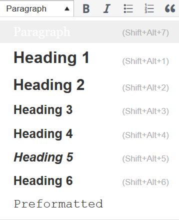
What do you need to do?
In Pressbooks, use the visual editor to tag sections with Heading 2, sub-sections with Heading 3, sub-sections of sub-sections with Heading 4, and so on.

Amanda Coolidge, Sue Doner, and Tara Robertson. Provided by BCCampus. Located at https://opentextbc.ca/accessibilitytoolkit/wp-content/uploads/sites/94/2018/06/heading-options-2.jpg. Licensed under CC BY: Attribution
Although Pressbooks provides up to six heading levels, that many levels might be difficult for your readers to keep track of. If you find yourself getting to four to six heading levels, consider breaking up your chapter into multiple chapters.
Textboxes with titles
If you are creating your textbook with Pressbooks, you might use some of the educational textboxes: Examples, Exercises, Key Takeaways, and Learning Objectives. Here is an example:
Examples
Type your examples here.
- First
- Second
These textboxes have two sections that are different colors. The section on the top is for the textbox title and the section underneath is for the textbox content. For people who can see the textbox, the different colors used in the textbox title communicate that the text is a title. However, this is not communicated to people using screen readers. As such, the textbox title needs to be marked as a heading.
Which heading level you use will depend on where the textbox appears in the chapter. The heading level should be one level below the section heading level it appears under. So in this chapter, “Textboxes with titles” is a heading level 2, so I have assigned the “Examples” textbox title heading level 3.
Media Attributions
- heading-options-2
- Adapted from BC Open Textbook Accessibility Toolkit. Authored by Amanda Coolidge, Sue Doner, and Tara Robertson. Provided by BCCampus. Located at https://opentextbc.ca/accessibilitytoolkit/. Licensed under CC BY: Attribution ↵
